UNESCO Lesson Plans
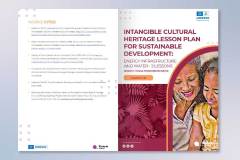
These Lesson Plans were designed in support of Unesco’s Change Projects for their ‘Education for Sustainable Development (ESD) in Southern Africa. Change Projects are self-defined institutional change initiatives that include curriculum innovations, pedagogical innovations and whole-institution innovations. These projects are orientated towards sustainability, and to relevant policy in participating countries.
The Lesson Plans focus on teaching practice improvements, assessment, integration of culture and indigenous knowledge into curriculum, community engagement, and science and technology innovations for sustainability.
| date created: | 2023 |
| duration: | 2 weeks |
| project type: | brochure |
| my role: | creative director, designer |
| design tools: | illustrator, indesign, photoshop |
| collaborators: | — |
Challenges
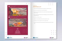
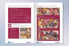
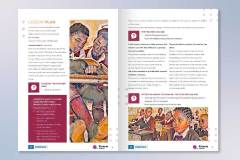
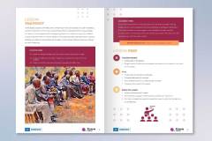
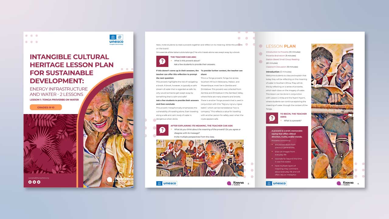
The challenging aspect of this project was that I had to design the pamphlet to be very concise, informational, and attractive for users of the project. I needed to include graphics, colors, and imagery that is relates to the culture of South Africa. I also needed to keep designs somewhat consistent with previously deployed Unesco Change Projects. All of the imagery and text needed to be conveyed across all spreads without being overcrowded. Overall, it was challenging to design something very informative and straight forward while also maintaining visual interest.
Solutions
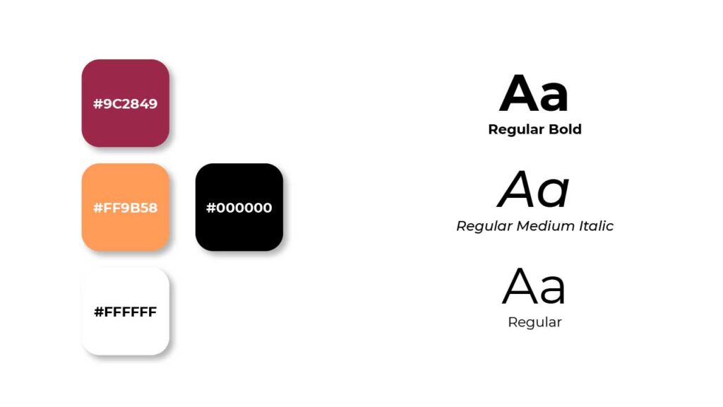
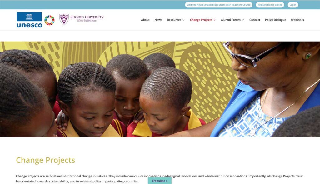
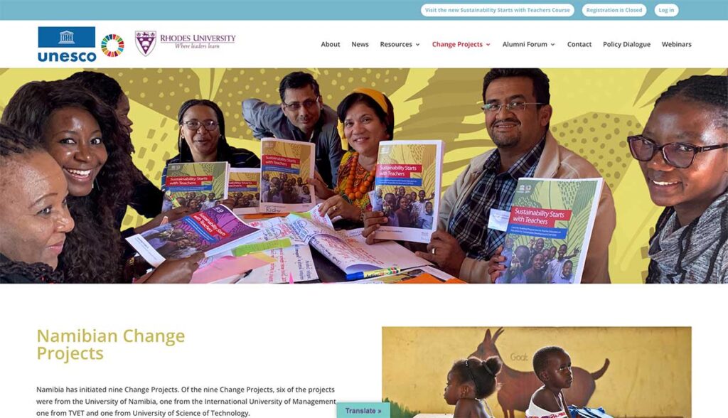
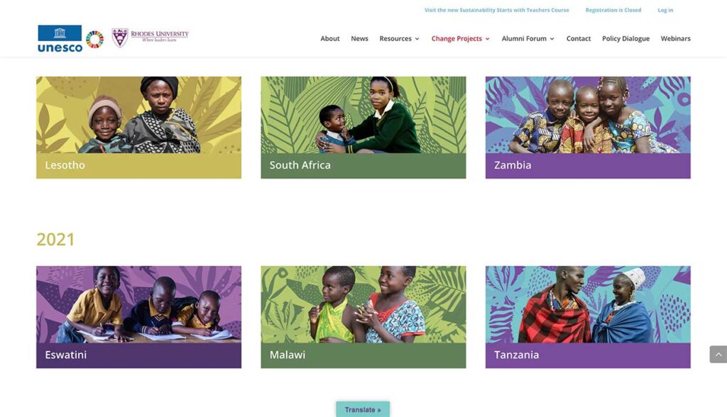
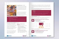
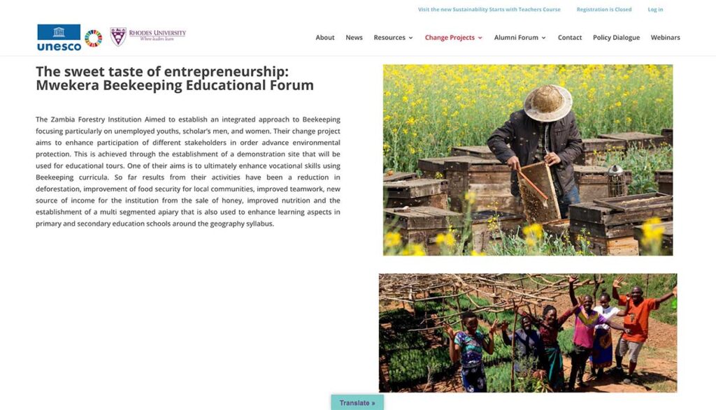
My solution was to mimic the design style the Unesco Sustainability webpage. It was the best way for me to get a feel of the organization’s personality and who it’s target audience it. I was suggested the brochure use warm colors, so I decided to use a burgundy red and orange colors. I thought the burgundy on the white background were very helpful drawing attention to important information and graphics. I also chose to use a filter on oil paint filter on all images used in brochure. The filter on the images complimented the rest of the color palette nicely and gave nice balance to appeal to the eyes of both adult and youth audiences.
In terms of the typography, I followed closely with the guidelines of the Knovva Academy’s branding. We use Regular for most of their type and like to heavily bold our titles and headings. I continued this typographic style and made sure to use various weights and colors to enhanced the importance of certain areas of the text. Overall, I wanted the brochure to reflect the beautiful design that the UNESCO’s ‘Education for Sustainable Development had already created as well as be legible to the viewer.
